Visual Inclination
UI/UX Design


Visual Inclinatuon
Design: Hira Fareed
1 Developer
Creative Director: Ivan Verlaan
Research analysis, Product design
Affable group of people, bound by a mutual love of film, design, technology and craftsmanship. Based out of Toronto and New York.
Empathize
In the initial brainstorming process, we looked over a variety of websites for inspiration and identified the pros and cons of each website. We brainstormed on how we could incorporate the good attributes (good call to action, simple and concise content, etc) into our website. The next step in the process was to decide the mood and expectations for the website.
I had meetings with the client to understand what they’re looking for in their website
1. The user feels cheerful & excited when he interacts with the website.
2. The user is excited to see what’s coming up next and would be ready to invest his time on the website.
DEFINE
I created three how might we questions which will help guide me in the design process.
IDEATE
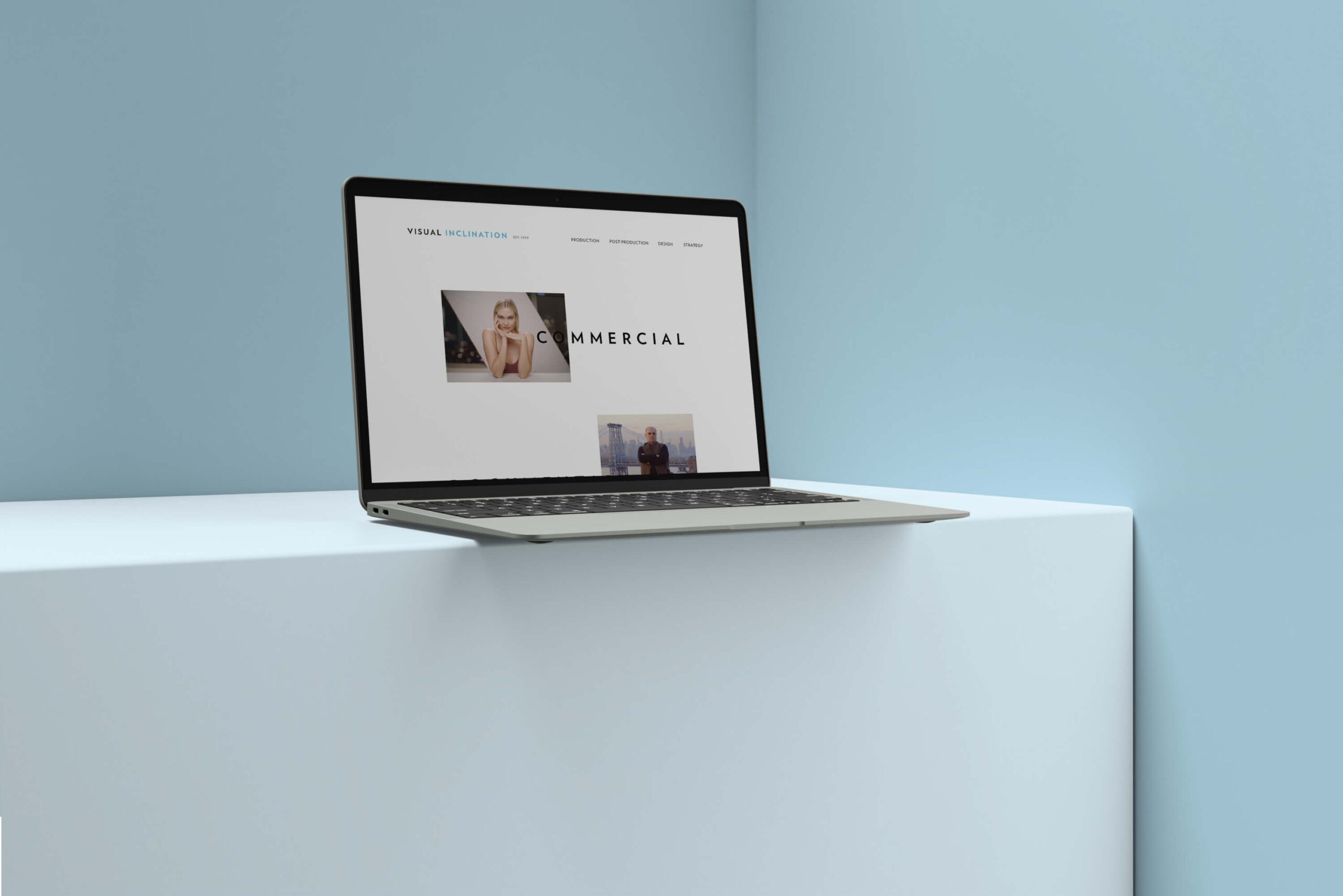
After our productive stakeholder meeting, we concluded that the homepage should prominently feature the company's wide range of services and place a strong focus on showcasing our notable work. Subsequently, we designed a concise, two-page sitemap.
After our productive stakeholder meeting, we concluded that the homepage should prominently feature the company's wide range of services and place a strong focus on showcasing our notable work. Subsequently, we designed a concise, two-page sitemap.
I provided the client with a range of enticing homepage possibilities, having first sketched several concepts on paper. These options encompassed diverse layouts, each featuring distinct arrangements of artworks, contact information, typography, and logo treatments.
Once the homepage design received approval, I proceeded to introduce the client to a selection of video page alternatives. These options continued to explore the intricacies of typography, logo positioning, and the arrangement of artworks and videos.
Prototype
The following phase was developing the details; it needed to end up being ready to fit the organized layout. The text hierarchy, graphics, as well as images, required to end up being coherent with the overall look & feel and delivering the message precisely.
I dreamed of being on a kayak between two huge icebergs, but i did do more. I was between, under and above them! We booked a tour at 30th of September, the last tour of season.